Who is this guide for?
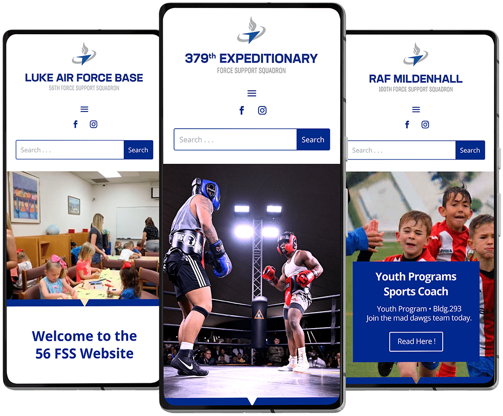
This guide is tailored for marketing managers at each base who are responsible for overseeing the Force Support websites. It serves as a comprehensive resource to assist them in maintaining site quality, implementing updates, and ensuring a consistent user experience across all bases.
How to Use the Guide:
To make the most of this guide, marketing managers should refer to it regularly when updating or managing their websites. It is structured into clear sections covering branding, content, technical standards, and best practices.
Each section provides specific guidelines and actionable steps, making it easy to follow and implement. Whenever there are questions or uncertainties, the guide should be the first point of reference.
Logo Usage Guidelines:
Approved Variations:
- Use only the approved logo variations provided (e.g., primary, secondary, monochrome).
- Avoid creating unauthorized versions or altering the logo.
Clear Space:
- Maintain a minimum clear space around the logo, equal to the height of the logo’s main element, to ensure it stands out and is not cluttered by other elements.
Minimum Size:
- Ensure the logo is always displayed at a size large enough to be clear and legible, with a minimum height of 50 pixels for digital use.
Color Usage:
- Use the logo in its approved colors. Do not alter the colors or use unapproved color combinations.
- For backgrounds that clash with the logo color, use the monochrome version.
Background Control:
- Always place the logo on a background that provides sufficient contrast for visibility. Avoid busy or complex backgrounds.
Proportions and Distortion:
- Do not stretch, skew, or distort the logo. Always maintain the original proportions.
- Scale the logo proportionally when resizing.
Unacceptable Usage:
- Do not add effects like shadows, gradients, or outlines to the logo.
- Avoid placing the logo within shapes or frames that alter its appearance.
Color Scheme:
The color scheme is fundamental to maintaining a cohesive visual identity across all Force Support websites. The primary colors should be used predominantly to reflect the brand’s core identity, while secondary and accent colors provide flexibility for different design elements and call-to-actions.
It’s important to ensure all colors meet accessibility standards, providing sufficient contrast for readability.
Always refer to the specific HEX, RGB, and CMYK codes provided to maintain consistency across all platforms and materials.
Typography
Consistent typography is essential for creating a cohesive and professional look across all Force Support websites. Use the approved primary font for headings and body text to ensure readability and uniformity. Font sizes, weights, and styles should be used consistently to maintain a clear hierarchy of information.
When custom fonts are not available, use the specified web-safe alternatives to ensure compatibility across all devices and browsers. Proper typography enhances readability and user experience.
Imagery and Graphics Guidelines
Image Selection
- Use high-resolution images to ensure clarity and professionalism. Avoid pixelated or blurry photos.
- Select images that are relevant to the content and reflect the Air Force brand and mission.
- Include images that represent a diverse range of people and activities.
Image Usage
- Maintain the aspect ratio to avoid distorting images. Crop images to focus on the main subject and remove unnecessary elements.
- Use a consistent style for images (e.g., similar color tones, filters, and compositions) to maintain a cohesive look across all websites.
Graphic Elements
- Use approved icon sets and illustrations that align with the overall design aesthetic. Ensure they are simple, clean, and easily recognizable.
- Ensure that all graphic elements are used consistently in terms of style, size, and placement.
Image Optimization
- Use appropriate formats (e.g., JPEG for photos, PNG for graphics with transparency).
- Optimize images for web use to ensure quick loading times without sacrificing quality.
Image Dimensions
- For Banners and Slideshows the maximum recommended size is 2000×800 px.
- For Images on the site the recommended sizes are 980×980 px and 980×700 px.
Legal Considerations
- Ensure that all images used are either owned by the Air Force, licensed for use, or sourced from approved stock photo sites.
- Provide proper attribution when required by the image license.
General Aspects
LAYOUT GUIDELINES
When managing the Force Support websites, it’s crucial to maintain a consistent and professional layout across all pages. To achieve this, we utilize the Divi Builder from Elegant Themes. The following guidelines ensure that all new content is aligned with our established design standards:
- Template Usage: Only approved templates from the Template Library should be used for creating new pages, sections, rows, and modules. This ensures uniformity and adherence to our branding standards.
- Consistency: Always adhere to the structure and style defined by the templates. Avoid making unauthorized modifications that could disrupt the cohesive look and feel of the websites.
- Customization: When customization is necessary, it should be limited to the options provided within the approved templates. For any significant changes, seek approval from AFSVC to ensure they align with the overall design principles.
- Updates and Maintenance: Regularly review and update templates as needed to keep them current with evolving design trends and standards, ensuring the websites remain visually appealing and functional.
NAVIGATION GUIDELINES
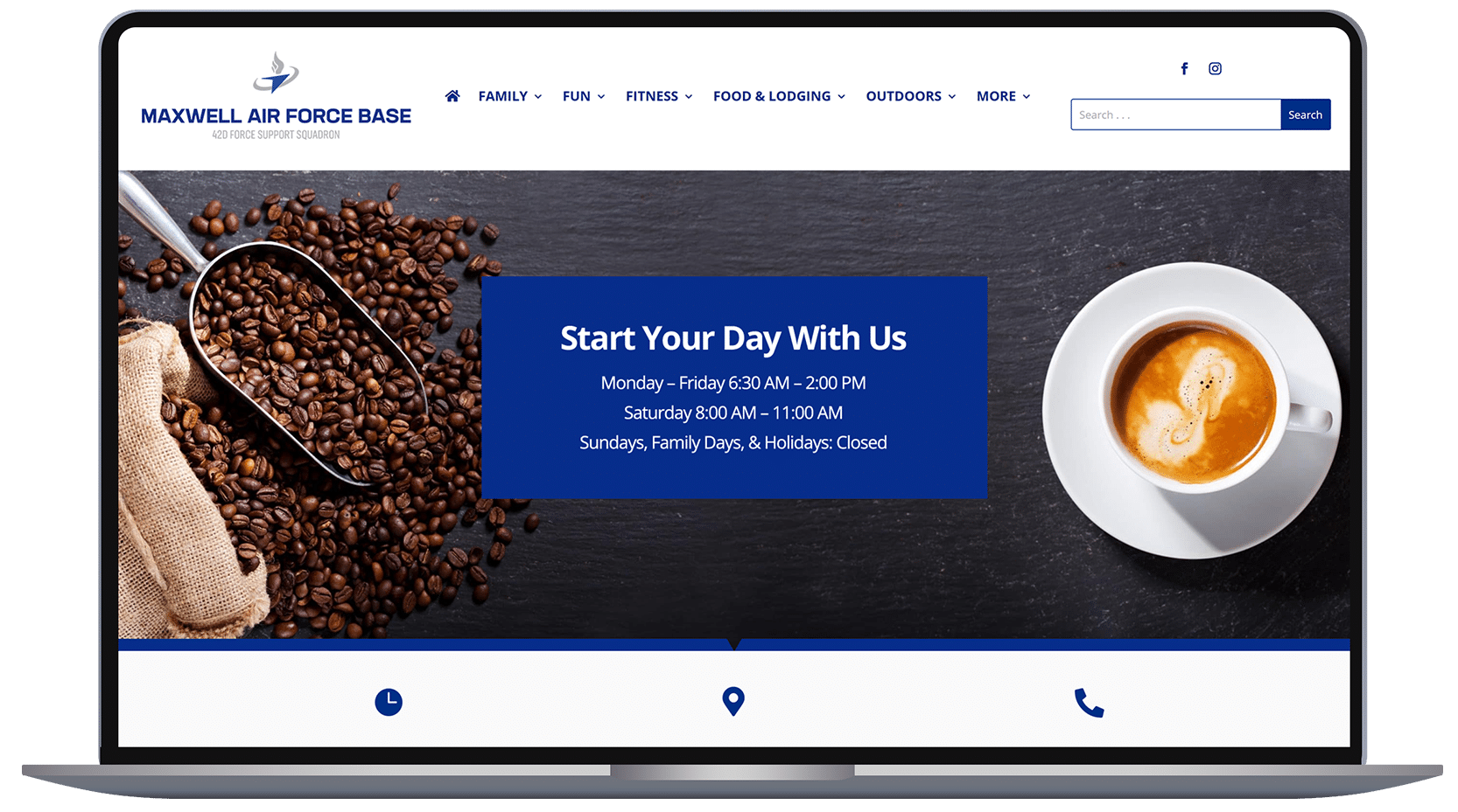
Navigation is a critical component of the user experience on Force Support websites. It ensures that visitors can easily find the information they need. To maintain consistency and usability across all sites, it is imperative that the navigation structure provided by Air Force Services is strictly followed.
- Standardized Structure: The navigation must adhere to the exact headings and links outlined by Air Force Services. This consistency not only reinforces the Air Force brand but also ensures that all users have a uniform experience across different bases.
- User Experience: A well-organized navigation system helps users find information quickly and efficiently. Deviating from the approved structure can lead to confusion and diminish the user experience.
- Compliance: It is essential to follow the navigation guidelines as provided. These guidelines were designed to meet the needs of all Force Support Squadrons and ensure a cohesive and professional presentation.
- Updates and Revisions: Any requests for changes or updates to the navigation structure should be submitted for review and approval to ensure they align with the overarching goals and standards set by Air Force Services.
NAVIGATION STRUCTURE
Pages that do not apply would be omitted.
HOME PAGE
SUGGESTED CONTENT
- Upcoming Events
FAMILY PAGE
SUGGESTED CONTENT
- Child Development Center
- Family Child Care
- School Age Care
- School Liaison
- Youth Center
- Military and Family Readiness
FUN
SUGGESTED CONTENT
- Arts & Crafts
- Auto Skills
- Community Center
- Conference Center
- Bowling
- Golf
- Library
- Information, Tickets, and Travel
FITNESS
SUGGESTED CONTENT
- Fitness Center
- Aquatic Fitness
FOOD AND LODGING
SUGGESTED CONTENT
- Food
- Dining Facility (name)
- Lodging
OUTDOORS
SUGGESTED CONTENT
- Outdoor Adventure
- FAMCAMP (Page)
- RV Storage
- Pool
- Parks, Trails, Water
JOBS
SUGGESTED CONTENT
- Current Job List
- NAF Human Resources
- Civilian Personnel
RESOURCES
SUGGESTED CONTENT
- Airman Leadership School
- Education Center
- First Term Airmen Center
- DEERS and ID
- Honor Guard
- Retiree Affairs
- Private Organizations
- Unite
DIRECTORY
SUGGESTED CONTENT
This page is designed to help managers easily manage and update contact information and service details.
CONTENT GUIDELINES
Effective content management is essential for maintaining the professionalism, usability, and consistency of Force Support websites.
These guidelines provide a framework for creating, updating, and managing content to ensure it aligns with the Air Force’s mission and values. By adhering to these standards, marketing managers can deliver clear, engaging, and accessible information to their audience while reinforcing the Air Force brand.
The content guidelines focus on writing style, SEO best practices, accessibility, and content updates to ensure every website remains relevant, compliant, and user-friendly.
Brand Identity Guide
Heading
If you want a different font-weight: go to Design > Heading Text > Heading Font Weight: Semi Bold
If you need a white heading: go to Design > Heading Text > Heading Text Color: Choose #FFFFFF
Capitalize each word. Do not use UPPER CASE or lower case for SEO purposes.
Note: For SEO purposes, only use Heading 1 ONCE.
Text Module
- Text Style Dark (for light backgrounds)
- Text Style Light (for dark backgrounds)
No need to edit preset setting. On copy & paste, ALWAYS PASTE AS PLAIN TEXT (CTRL+SHIFT+V).
H1: Your Title Goes Here
H2: Your Title Goes Here
H3: Your Title Goes Here
H4: Your Title Goes Here
H5: Your Title Goes Here
H6: Your Title Goes Here
Your content goes here. Edit or remove this text inline or in the module Content settings. You can also style every aspect of this content in the module Design settings and even apply custom CSS to this text in the module Advanced settings.
Section Preset
Use Content Default preset and you can change the background color with the ones approved.
Note:
- Make sure the section have different background color from previous section.
- This preset is ready for responsive – do not touch spacing setting.
- If you need a custom preset then create a new one, but I suggest that all sections for content should have the same padding.
- Class: add-overlay, fixed-bg (for fixed image background)
Row Presets
There are 3 widths for rows:
- Size 1 (80% of screen *XLarge)
- Size 2 (1200px *Large)
- Size 3 (960px *Medium)
If you need smaller width: go to Design > Sizing > *Width. Do not touch other Sizing parameters esp Max Width.
If you need the rows to be centered vertically, choose from the ff:
- Size 1, Centered Vertically
- Size 2, Centered Vertically
- Size 3, Centered Vertically
Brand Identity
1.1 Brand Overview
- Brand Mission: A brief statement about the purpose and core values of the brand.
- Brand Values: Essential principles that guide the brand’s actions and decisions.
1.2 Voice and Tone
- Brand Voice: Defines the overall personality of the brand (e.g., friendly, professional).
- Tone Guidelines: Adjustments to the tone based on the context (e.g., casual on social media, formal in emails).
2. Logo Usage
2.1 General Rules
- Ensure logos are always clear and legible against background colors.
- Maintain a minimum space (specify “X” space) around logos to avoid visual clutter.
2.2 Logo Placement
- Force Support Logo: Place in the upper left corner of the website header.
- Air Force Services Logo: Display in the bottom right corner of the website footer.
2.3 Logo Variations
- Refer to the brand guidelines for alternative versions and use them only when necessary.
2.4 Activity Logos
- Each activity page (e.g., Fitness, Bowling, Arts & Crafts) should include its corresponding logo at the bottom.
3. Color Palette
3.1 Primary Colors
- Specify primary colors in HEX, RGB, and CMYK formats.
- Main uses: website background, headings, buttons, and links.
3.2 Secondary and Accent Colors
- Complement primary colors with specific secondary colors.
- Uses: hover effects, alerts, and call-to-action buttons.
3.3 Color Usage Rules
- Ensure adequate contrast between text and background for readability and accessibility (SEC 508 compliance).
- Avoid overusing colors that dilute the visual impact of the brand.
4. Typography
4.1 Primary Typography
- Primary Font: Name and family of the web-safe or hosted font (e.g., Google Fonts).
Heading Styles:
- H1: Size 36px, bold, centered, uppercase text, color #333333.
- H2: Size 28px, semi-bold, left-aligned, capitalized first letter, color #333333.
- H3: Size 22px, medium weight, left-aligned, color #555555.
Body Text Styles:
- Body Text: Size 16px, regular weight, left-aligned, color #333333.
- Small Text: Size 14px, regular weight, color #777777.
4.2 Secondary Typography
- Define a secondary font for specific uses or accents.
5. Image Guidelines
5.1 Photographic Style
- Bright and Vibrant: Well-lit images that reflect energy and positivity.
- High Contrast: Highlight key elements, ideal for promotional banners.
- Natural Lighting: Avoid artificial lights to convey authenticity.
- Color Consistency: Align images with the brand’s color palette.
- Minimalism: Reduce unnecessary elements to focus on key content.
5.2 Types of Images
- Hero Images: Used on main pages to make a strong first impression.
- Product Shots: High-resolution images with a neutral background.
- Lifestyle Images: Products or services in real-life scenarios, showing diversity and inclusion.
- Thumbnails: Clear and consistent visual references in size.
- Banner Images: Eye-catching without overwhelming the design.
6. Graphic Elements
6.1 Illustrations and Icons
- Minimalist Style: Simple and clean designs with subtle depth.
- Consistency: Uniform use of colors, proportions, and stroke styles.
- Interactive Icons: Visual changes on hover, active, or disabled states.
6.2 Decorative Elements
- Background Patterns: Subtly integrated with the brand’s color palette.
- Buttons and Call-to-Actions: Define colors, sizes, and clear transitions to enhance user interaction.
7. Image Management and Usage
7.1 Brand Consistency
- Aligned Style: Images that reflect the brand’s values and mission.
- Diversity and Inclusion: Equitable representation of cultures, genders, and ages.
7.2 Copyright and Licensing
- Use proprietary images or those with proper licensing.
- Attribute credits when necessary.